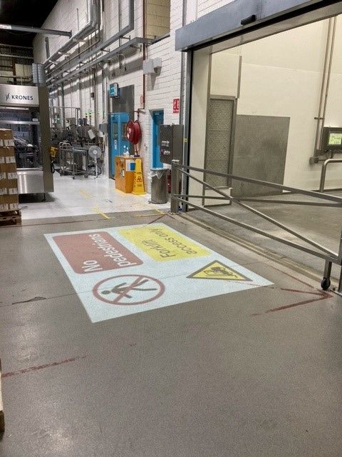
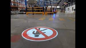
Virtually projected signage just needs an image projector (also known as a gobo projector) and an image carrier (also known as a gobo). This eliminates the need to constantly replace outdated signs. The gobo, which resembles a slide but is much more durable, is installed within the projector. The projector is set up at a practical location close to the region that will be projected, like the ceiling. The suitable surface is subsequently projected with your chosen safety message, which is then clearly visible even in dim lighting.
Support / Gallery
How it Works
Projector Set Up
Introducing our Projector Set Up PDF. Simplify your setup process and enhance presentations.
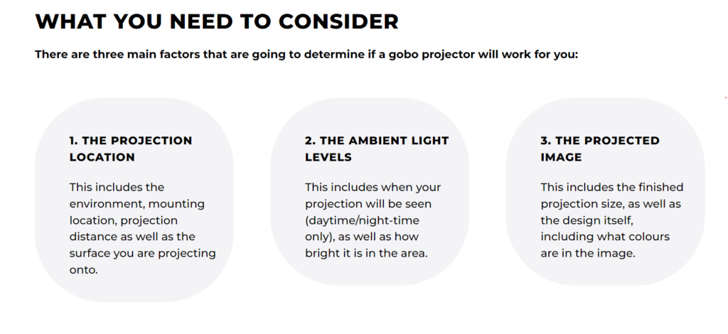
Projector Selection
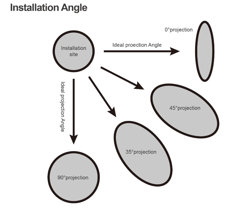
PROJECTING AT AN ANGLE
The projection angle is something to be aware of. An image that is distorted and out of form results from projecting a gobo at an angle rather than perpendicular to the centre of projection. ‘Keystone effect’ is the term used to describe this.
Depending on the image—some are more forgiving than others—as well as the angle itself, the degree of distortion will vary. The distortion becomes more pronounced the more extreme the angle.
PSYCHOLOGY BEHIND SAFETY SIGNS
Signs are used all over the world; regardless of language, alphabet and culture, they all follow the same sort of layout, with similar images and colors so that everyone can understand them within seconds.
Color also has a huge role within safety signs as each color tells you at a glance what the essence of the message is – red signifies danger, yellow often denotes caution – so you can modify your behaviour even before you read the content.
The main use of safety signs
These signs have several uses and applications, with some being more important and immediate than others. Mainly, safety signs are used to:
- Highlight health and safety issues and potential hazards;
- give directions and information;
- instruct employees and visitors and remind them about personal protective equipment (PPE);
- point out the location of emergency equipment, and
- point out which actions are unsafe or prohibited and which are mandatory.
A sign’s color will be determined by its purpose – red is immediate danger, yellow is caution and so on.
Colors and meanings
Red – red indicates danger, or instructs people to minimise or eliminate dangerous behaviour. There can be stop signs, signs pointing to emergency cut-out switches and warning signs. Red signs usually are round with red edging and black and white words or images. The red portion of the sign needs to be at least 35% of the total area.
Yellow or amber – this color denotes important information and instruction, like wet floor signs. The color yellow helps the sign to stand out but makes people read the notice before proceeding. Usually yellow signs are triangular with very little or no white, and black text or images. The yellow area needs to be at least 50% of the total area to be effective.
Blue – this color is used to impart instructions or information. They don’t warn of any danger, but they do give information or instructions that must be heeded, such as PPE reminders or parking directions. As with yellow, blue must make up at least half of the sign, but the text can be black or white.
Green – this is for signs that are used to direct people and to point out important features in a building or environment, like first aid signs or exits. Green isn’t as intrusive as red, yellow or blue, but it’s still instantly recognizable when the need arises. Green signs are usually square or rectangular with white text or images and a 50% green component
The psychology of color
It’s important to recognize the psychological impact of colors on cognition and behavior. Each color has its own meaning – red is the strongest and provokes the biggest reaction, which is why it’s used for the strongest of emergency and danger signs.
Blue is also a powerful color, but it denotes wisdom and information. It’s a popular and neutral color, so people respect it and pay attention. Blue is associated with intelligence, which is why it’s used to impart important information.
Yellow is the brightest of sign colours and is the first one the human eye notices – it’s also the most visible to visually-impaired people. This reason is why it’s used in road signs and in hazard warnings as it’s hard to miss.
Green is associated with peace, generosity and freedom, which is why it’s used for exits and first aid signs, as these places represent freedom and kindness. People will run towards them in a crisis, rather than away, as may happen with red or yellow.
HOW A VISUAL WORKPLACE IMPROVES SAFETY
What connection does your safety programme have to a visually appealing workplace? It can serve as a covert training programme as well as one of your best instruments for raising and sustaining staff awareness.
Being visual creatures, humans. We are designed to use our primary sense of vision to understand our surroundings. You use your sense of sight to observe, decode, and record vast amounts of data every day. Though much of it is subconscious, it is quite real. Why not capitalise on this wholly organic process to impart safety principles, disseminate knowledge about safety resources, and keep safety at the forefront of your employees’ minds?
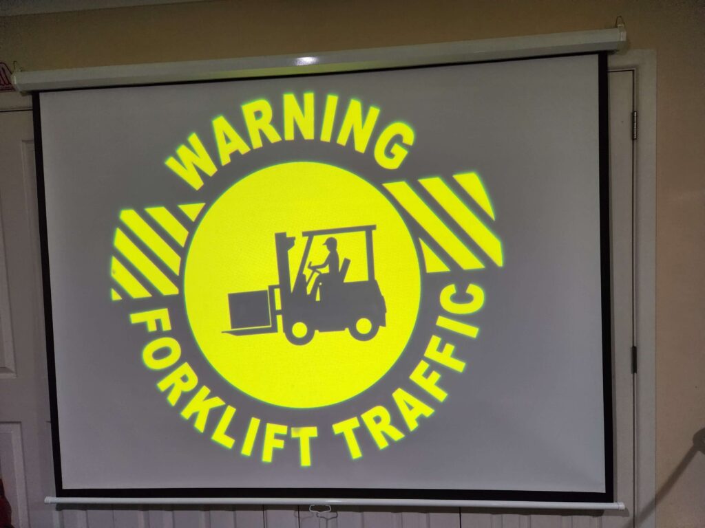
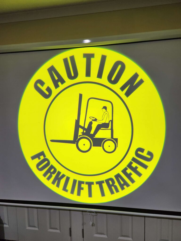
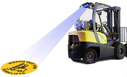
MOBILE MACHINERY VISUAL SAFETY
Forklift safety is a critical risk to every business, as there are 100s of people killed or injured every year.
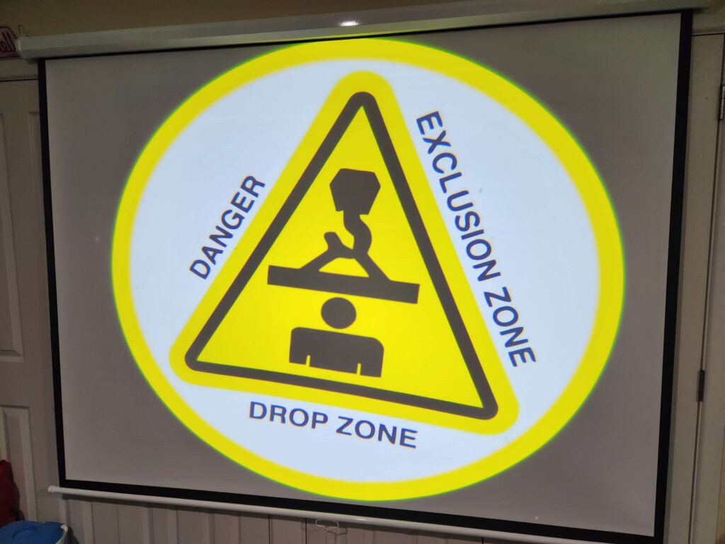
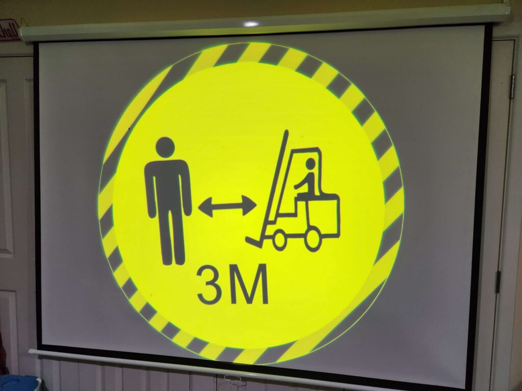
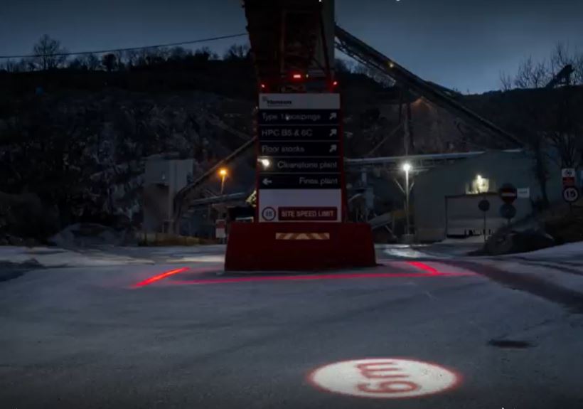
When using or around a forklift it is important to understand the safe and unsafe zones. Exclusion zones can either mean an area designated only for forklift or HMV, or an area around a forklift or crane drop zone, whereby if any person is in it, the forklift should be stationary or made safe. The exclusion zone can also be understood as excluding people from its surroundings or it being the danger zone. The distance should be calculated based on Risk. Don’t be mistaken, as the visual illumination does not stop a forklift, it is used for creating awareness and alerting people in close vicinity.
Purpose of using the Gobotise projector is to provide an alert and demarcation of the safe/unsafe zone. Depending on the light condition the image can be highly illuminated and will not be missed by pedestrians. As per Worksafe mandate, it is the duty of the PCBU to communicate and provide a safe workplace.
INSTALLATION ANGLE
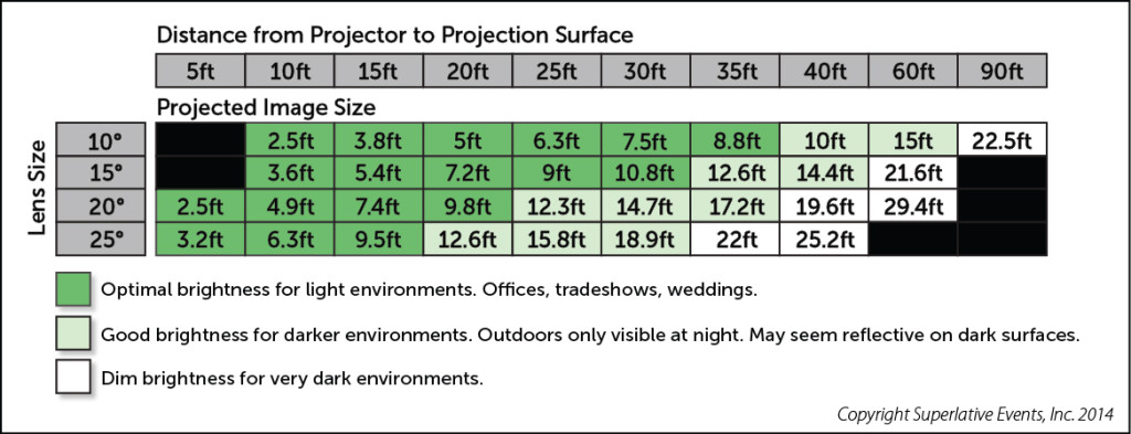
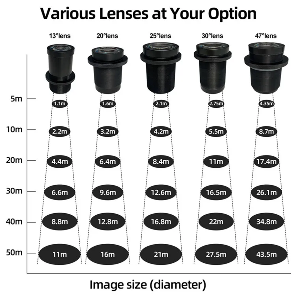
Projection distance guide
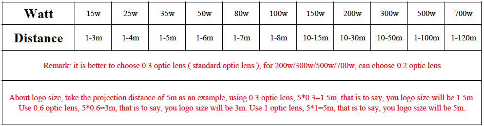
PROJECTION CHART GUIDE